Kevin Sampson
Mobile & Web Developer

Mobile & Web Developer

Below are links to projects I have worked on. These include Computer Science, Graphic Design, and other relevant works.
Email: kevjsamp@gmail.com
LinkedIn: linkedin.com/in/kevinjsampson/
My resume is available to view and download below.
This position completes development for the Gamerfit website, which is a platform for delivering video content, Telehealth coaching, and exercise-gaming activities to improve physical activity among youth.
This position completes development for the Gamerfit app, which is a platform for delivering video content, journaling, and Telehealth coaching to improve physical activity among youth with neurodevelopment disorders. Beta testing conducted with Apple's TestFlight software.
Snapchat Geofilter I created for the city of Melrose, MA. This filter shows up for anyone inside the city borders. Created using Adobe Photoshop & Illustrator.
An Arcade Shooter inspired game created in Java. Demonstrates graphical user interface animations and pixel art.
Below you will find projects I have worked on through utilizing the Adobe InDesign & Illustrator applications.
Below you will find projects I have worked on through utilizing the Figma application.
Patagonia Website Redesign
The goal for this type of website is to sell products and generate leads for services. The focus in this redesign is to organize the information and create web page layouts to best promote the products of the brand Patagonia.
User Experience App & Website Design
A fully interactive prototype created in Figma. Consisted a user experience brief, prototypes, usability tests, and user interface designs in both app and website formats. The focus in this design is to create a enjoyable user experience for a hypothetical dining service app for Merrimack College.
Created in Swift for use on Apple iOS devices, and stored in Google Firebase. Assessment of a users wellbeing over a prolonged course of time. Beta testing conducted with Apple's TestFlight software. Designed and created the logo for our team, Y2K, for this project.
Requirements Document
User Manual Document
Functional Specifications Document
A prototype for an advertisement listing application. Created in SwiftUI and stored in Google Firebase. Similar to the website Craigslist, this allows users to create an account then create and search postings.
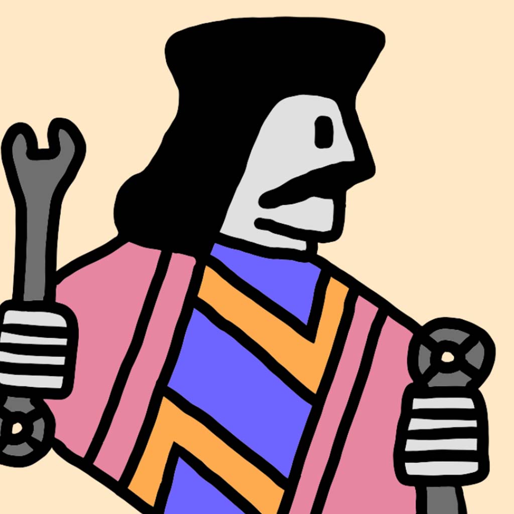
This app is called JackTrade which is a reduction in words from the phrase Jack of all Trades. The app caters to people who have occupational skills and to people who are in need of said skills. It basically acts as a middleman between these two groups to link them up so that skilled workers can get their name across and customers can get quality work done that they can’t do themselves. Usually people will get their name across through facebook groups and such if they are just starting out but we figured that a specialized app that caters specifically to these groups of people would be better in terms of a community.
When you first look at the app, you notice that the logo is quite reminiscent of the Jack from a deck of cards. Through researching a variety of different Jack playing cards, I took note of some design details. Firstly, the top part of the card becomes mirrored vertically downward towards the center portion of the card, so you could view the card normally and upside down. Secondly, the Jack card usually is holding an object of somesort, presumably a staff. I decided to add the mirror effect in our design, as well as replacing the held object with a held wrench. With this card idea holding a connection to the word “Jack” , the wrench is how I decided to incorporate the word “Trade”. The wrench seemed like an ideal stereotypical tool to represent the occupational catering our application has to offer.
I took into account color blindness and looked for colors that would assist in viewing them better. The most common type of color blindness makes it hard to tell the difference between red and green. There are four different variants of this red and green type as well, however the most common of the four is Deuteranomaly. This led to the use the non-neutral colors represented on our app logo. The red-pink color used in our logo is further reused in our app as a tint color in a variety of locations, such as buttons.

Below you will find assets I have created through utilizing the Aseprite & Adobe Illustrator applications.